DOUGLAS DC-8: The art of advertising

By Mike Machat Wed Mar 18, 2015
Nothing captured the sheer excitement of air travel at the dawn of the Jet Age like the colorful and dramatic ads appearing in print media of that era. In this new AirlineRatings series, Editor Mike Machat takes us on a nostalgic tour of some of the world’s greatest airline ads, giving an ‘inside look’ at the creative process used to create these fabulous aviation images.
Any classic airline ad of the mid 20th Century began with a concept developed by the Art Director in an advertising agency’s art department. These talented visionaries were responsible for the overall mood, content, and visual impact of the ad, and in our first example, we see a group of elegant passengers boarding a Douglas DC-8 jetliner which was just then entering airline service.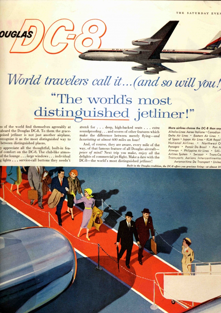
Let’s start with the copy, written to capture the exhilaration of traveling aboard a new jet-powered airliner. Passenger-pleasing features like “large windows,” “individual reading lights,” “deep, high-backed seats,” and “extra soundproofing” invite you to climb aboard. Then there’s the impressive list of DC-8 operators. Yet as good as all this copy may be, it’s there to support the illustration, and this is where ads of the 1950s truly excelled.
Using the popular vogue of peering down from a control tower, observation deck, or other high vantage point, we see First Class passengers walking down the obligatory red carpet, complete with stanchions, to the boarding stairs of the jet. All aspects of travel are depicted here, with two dapper well-dressed businessmen leading the way, followed by possibly a movie star, a vacationing couple, and other assorted passengers.
The artist hired to create this illustration plays with reality to give the viewer a dramatic and compelling image, and this is always the fun part of analyzing these classic advertisements. First, look at the engine nacelle featured so prominently in this scene. Douglas DC-8s were actually 150 feet long, yet the wing on this jet would be a scant 20 feet aft of the L1 door.
Second, the passenger’s shadows are ‘designed’ for best impact. If plotted accurately, the movie star’s shadow would merge with the dark suit and head of the businessman holding the umbrella (which is somehow missing from his shadow). The flight attendant’s shadow is missing entirely. Why? If it were there, it would distract from the passengers because of its harsh contrast with the white boarding stairs.
And finally, there’s the highly effective use of light-and-dark contrasting shapes with primary colors - red carpet, blue tarmac (and woman’s coat at upper left), plus a variety of yellow and beige accents. The diagonal red carpet provides a strong visual device as well. These elements are all carefully designed to grab the viewer’s attention and make your eye travel around and through the intricate composition.
Do the technical inaccuracies really matter? No, not at all. Both the artist and Art Director have only one objective in creating this scene, and that’s to make you stop and look at the image, read the copy, then reach for the phone and call your travel agent to book a flight. It’s just that simple. Judging from the great boom in air travel during the early 1960s, I’d say this ad was highly effective indeed.
Have questions or want to share your thoughts?