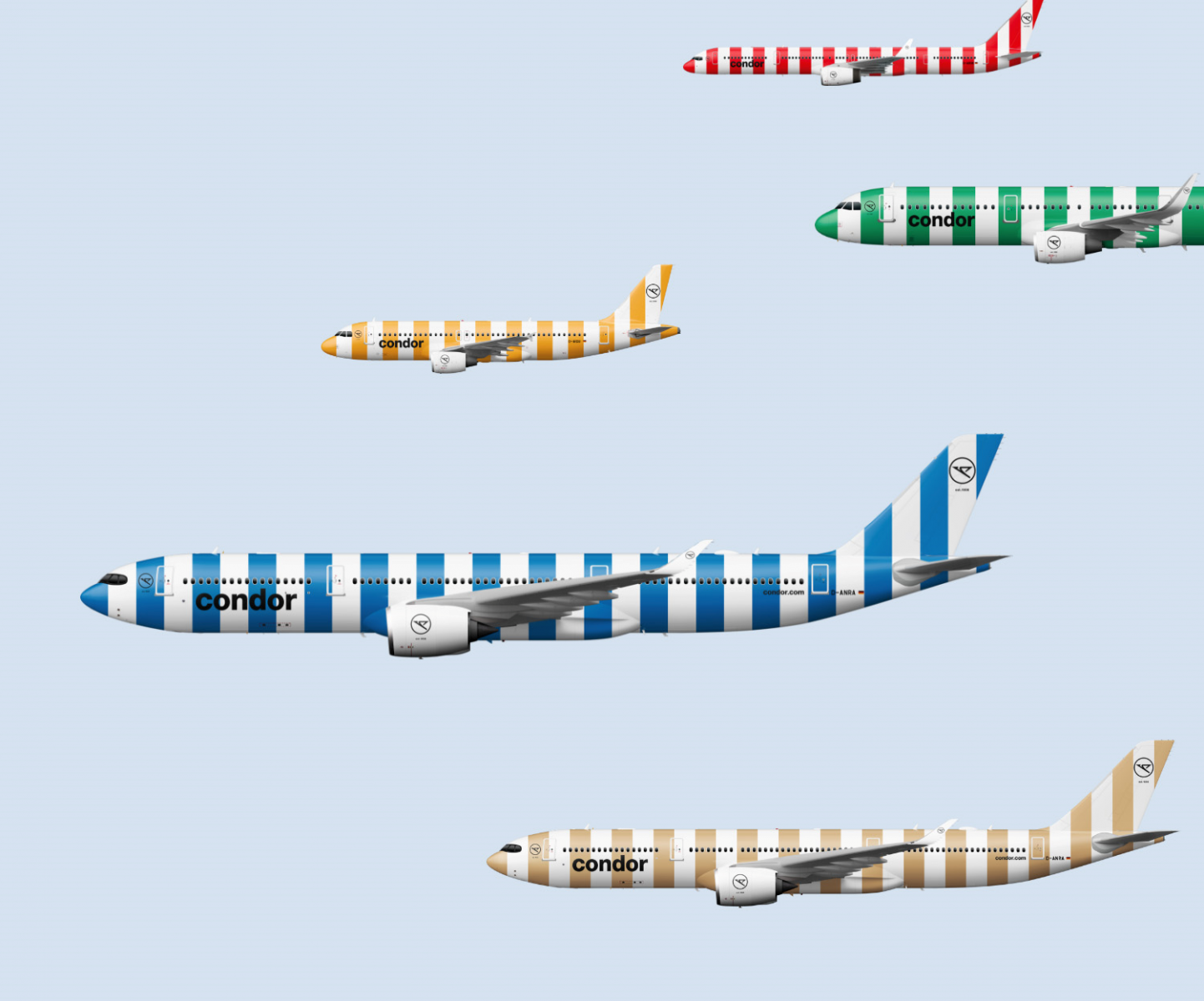
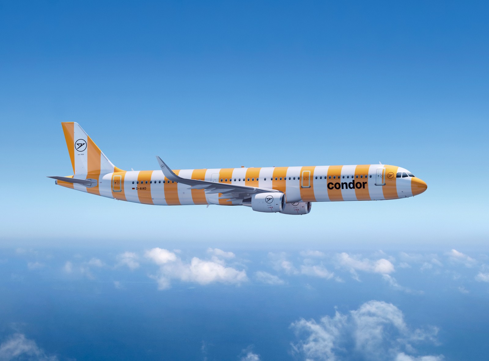
German charter airline Condor has possibly created the worst airline colour scheme ever with its new striped livery.
However, it argues that "Condor is vacation. And vacation is stripes."
No matter if you hate it or like it - you will not miss it!
In the future, it says the airline's aircraft will wear stripes in five colours inspired by parasols, bath towels and beach chairs.
READ: Etihad Airways unveils its new A350
READ: Virgin Australia launches new Business Flyer Loyalty program
Ralf Teckentrup, CEO of Condor said the airline "has undergone a transformation over the past two and a half years: From a subsidiary of a vertically integrated travel group to an independent airline that looks back proudly on its history and tradition, while at the same time embarking on the path to the future. We want to express this unmistakably through our corporate identity.
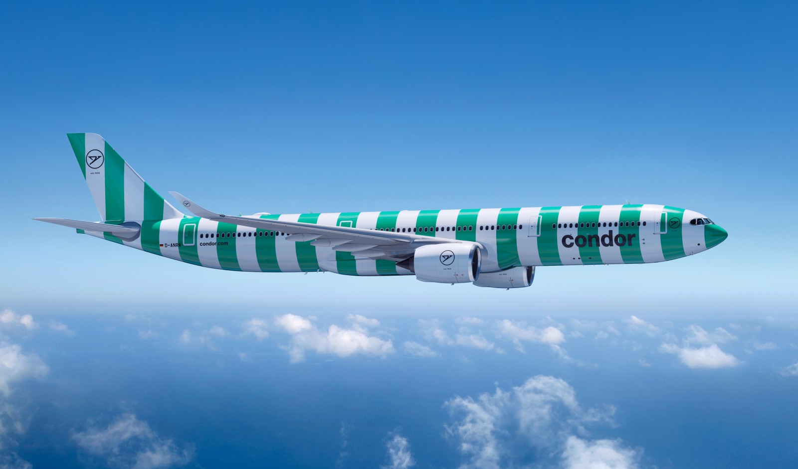 "Our new trademark is stripes, our figurative mark stands for our origin and the colours for diversity. This triad is new, what remains is our passion. It has always made Condor unique and is therefore also reflected in our claim: Passion is our compass."
The conception and creation of the new brand identity say Condor came about under the direction of Remo Masala, owner of the creative agency vision alphabet in Berlin.
"Our goal was to endow Condor with a special visual independence, the rationale of which is united in Condor's brand essence: the invention of the vacation flight, and the effective vacation code, the stripes of summer, joy and freedom."
Initially, the aircraft will carry five colours in a striped look: yellow, red, blue, green, and beige stand for the facets of the diversity of its guests, employees and the multitude of opportunities to discover the world the airline said.
Around 80 per cent of the fleet is to be repainted by 2024.

Have questions or want to share your thoughts?
